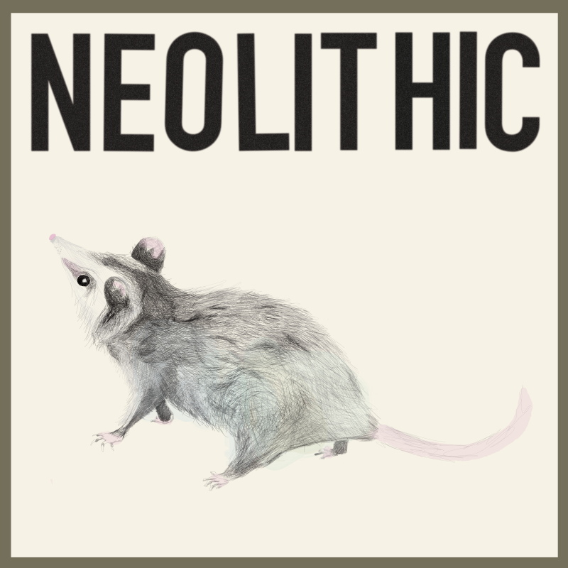
In the before times, I was asked by Ben Abrahamson to bring his vision for a snarky possum to life. Ben’s music is classical flamenco in style, and his influences are vast. After meeting with Ben to learn a little bit more about what he was looking for, hearing that his vision for this project was “perfectly imperfect”, I knew exactly how to visually present Neolithic in a way that complimented Ben’s goals.
After doing a bit of research about possum stance, and general behavior, Ben and I decided on a profile view for the front cover, where his possum buddy would be curious about the imposing word on the cover. After fine tuning the color selection just a bit, Ben approved the final album cover, pictured below. This possum is curious, yet apprehensive of those imposing letters.
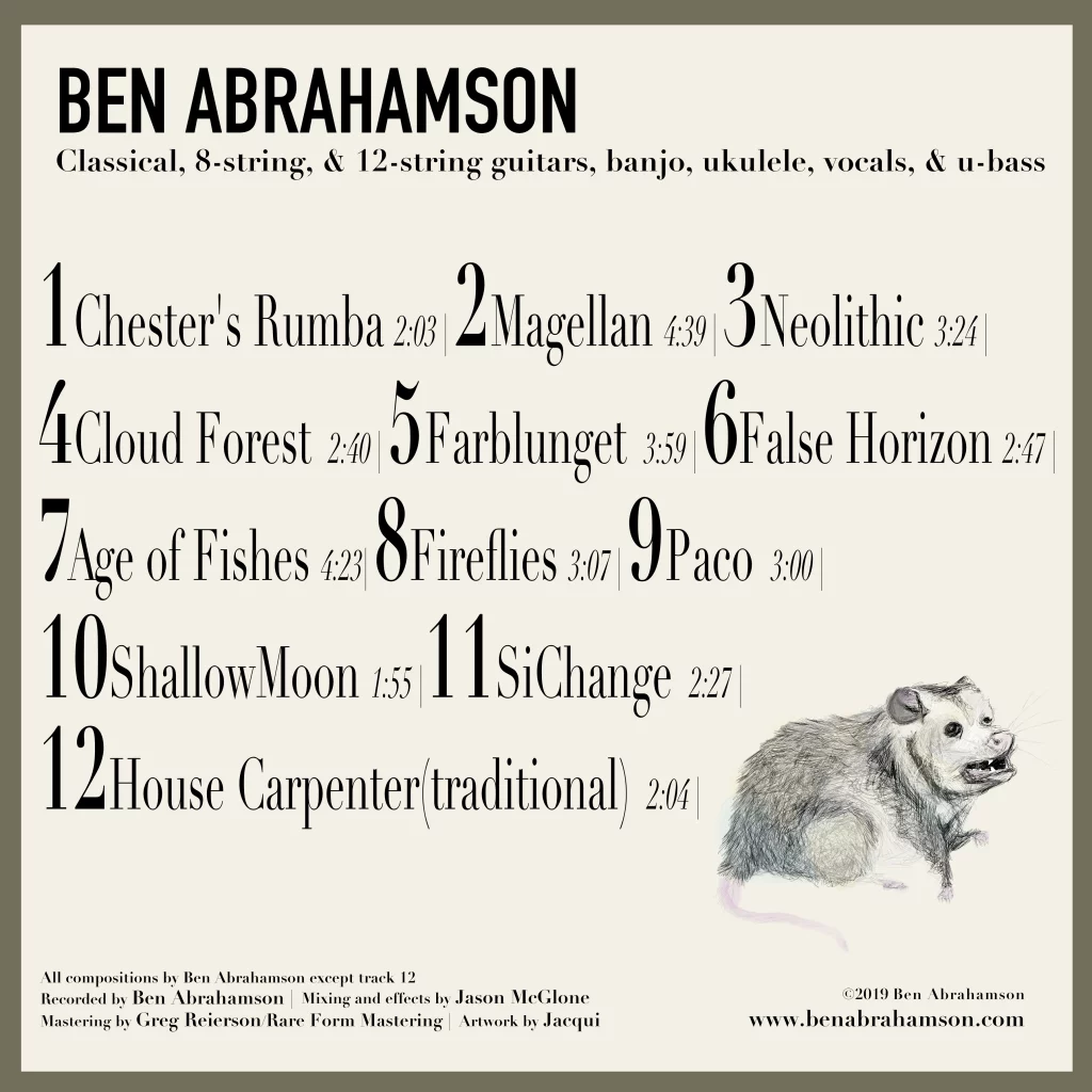
Choosing a complimentary font to the bold, commanding font used for the front cover’s album name was a lot of fun! This combination of serif and sans serif font, and playfulness in font sizing is echoed in the face of the possum on the back cover. The expression of this possum is meant to bring the listener in, as if to welcome them to the exclusive life of the possum.